
According to a DemandSage report, 60.67% of online traffic in 2024 was from mobile users. This, and the fact that Google prioritizes mobile-first indexing are big enough reasons to make mobile friendly websites a priority.
Unfortunately, there’s a lot of outdated or inaccurate information out there. Rather than improving your SEO results, outdated practices can hurt your rankings instead.
So, what are the best practices for a mobile-friendly website in 2024?
In this blog, we disclose our recommended strategies for building a mobile-friendly website that still work today.
SEO Tips and Best Practices for a Mobile Website
To get the most from your mobile SEO, you need to ensure that your website:
- Has content that fits on every screen, also known as responsive design. Your website should adjust the width and the height according to a user’s device automatically.
- Incorporates technical considerations, such as page speed
- Has optimized content
- Prioritizes intuitive browsing experiences
Here’s how you can get your website to do all of the above:
1. Opt for a Responsive Design
A responsive website design is the cornerstone of mobile-friendliness.
Responsive designs adapt the content to fit the viewing device. Basically, your website should be able to mirror the desktop experience on smaller screens. Your web developer can help you do this.

Image Source: https://pixabay.com/illustrations/website-responsive-creative-design-3374825/
This process involves accounting for the varying sizes, configurations, and operating systems phone developers use.
The key considerations to achieve a responsive mobile website design include:
- Readability: Instead of only reducing the web page sizes, enlarge the font to ease visibility and practice conciseness.
- View orientation: Landscape and portrait viewing should accommodate everything on a page without out-of-place elements.
- Load times: Quick loading reduces bounce rates, while faster backends and lower time-to-first-byte boost SERP rankings. You can boost load times using Accelerated Mobile Pages (not for all sites) or a progressive web application.
If you’re doing eCommerce SEO, incorporating a responsive mobile design promotes intuitiveness, which:
- Improves conversions by up to 400%
- Boosts engagement likelihood by up to 52%
- Promotes the chances of repeat business by up to 88%
Responsive designs also allow for single-URL page sharing, are easy to maintain, eliminate redirects, and promote faster Google indexing.
2. Fix Your Technical SEO
Technical SEO is the foundation of a SEO-friendly website. No website today can get away with having poor page speed and user experience and still retain its SEO presence.
Besides fixing page speed and other code issues, you need to also pay attention to structured data markups if you want to see your website perform well in mobile and desktop SERPs alike.
Structured data markups help bots understand your content better. Structuring also enables accurate categorization, faster indexing, and better ranking.
In 2024, at a bare minimum, a mobile-friendly website also needs to have mobile-friendly URL structures and canonical tags. To do this:
- Ensure URLs don’t change with every image load for proper indexing.
- Avoid fragment URLs (fragment parts begin with #). Google can’t index fragmented URL pages, so you won’t rank.
- Link mobile URL hreflang elements for internalization so that they point to mobile URLs.
- Use the right rel=canonical elements as illustrated below.
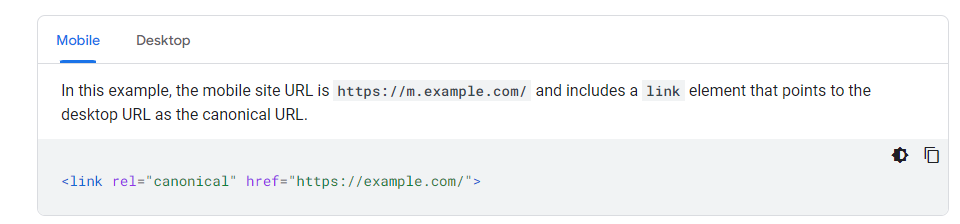
Image source: https://developers.google.com/search/docs/crawling-indexing/mobile/mobile-sites-mobile-first-indexing#mobile_1
3. Optimize Your Content for Local SEO
Most local searches (such as “near me” searches) begin on mobile devices. As your Google Business Profile and website are inexplicably linked and influence each other’s performance in local markets, it is wise to pay attention to local SEO to see more traffic to your website from mobile devices. Getting local citations, in addition to your Google Business Profiles (GBPs), can also send a lot of traffic to your website if you do it right.
Here are some tips you can follow to improve your local presence:
- Earn positive user reviews
- Curate locally-relevant content on your GBP and blogs
- Optimize your Google Business Profile correctly, and update it when things like your hours change.
4. Optimize Title Tags, Meta Descriptions, and Illustrations for Mobile
Understanding how to craft title tags and meta descriptions is also essential for website SEO.
Excellent meta descriptions for mobile are concise (up to 120 characters), unique, and descriptive. Avoid a long string of keywords in your meta descriptions, as this lowers display likelihood. Meanwhile, title tags shouldn’t exceed 60 characters to avoid truncation.
Additionally, embrace mobile-friendly formats when it comes to videos, visuals, and infographics. Ensure users can share, scan, and digest these with ease.
According to Imagify, ideal image specifications for mobile-friendly use are as follows:
| General aspect ratio | 4:3 |
| Ratios for banner images | 4:5, 1:1, or 1:9 |
| Dimensions | At least 800px |
| Pixels | 72 ppi |
Don’t exceed images of 1200 x 630 pixels for intuitiveness.
Make infographics concise, use bold fonts, and break numerous statistics to ease skimming.
Test videos to ensure users can play and view the entire scene on mobile. Some sites may have separate settings for playing videos on mobile.
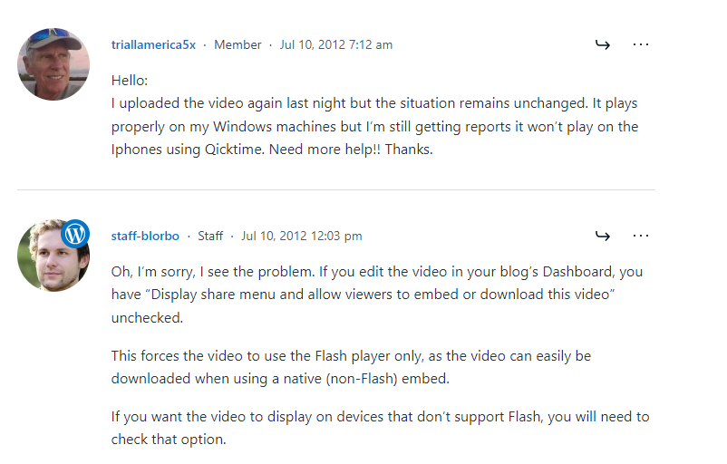
Image source: https://wordpress.com/forums/topic/cant-see-video-on-mobile-devices/
Others clip videos, displaying only part of the scene to mobile users. You can solve this issue with a site-supported video resizer plugin.
5. Focus on Mobile-Friendly SEO and UX
An intuitive mobile interface is more important than the desktop experience.
Like we mentioned previously, Google uses a mobile-first indexing approach. Furthermore, improving mobile UX ensures users can access your features with ease. A friendly UX also boosts your chances of performing well on Google and Bing, as it attracts better retention, conversions, and revisits.
One way to use mobile SEO to enhance UX is by implementing friendly call-to-actions (CTAs).
Ensure the text is compelling, concise, and clear. Also, make the buttons visually arresting and use at least 44×44 pixels.
Also optimize your website to address the specific needs of mobile users and account for their behavior. For instance, mobile users typically spend less time on pages than their desktop counterparts. An average mobile viewer’s session lasts between 704 and 775 seconds, whereas desktop users may spend over twice as much, with durations ranging between 996 and 1,918 seconds. That’s why it’s essential to tailor your interface to make information easily accessible to mobile users.
When you’re dealing with a large amount of text, you may also want to save space on mobile by having less content than on a desktop. Use tabs or accordions to ensure the information offered is the same but condensed into neat menus.
After optimization, confirm that bots can index everything on your site using tools like Google’s Fetch.
Furthermore, optimize for largely mobile-specific search features like voice search to see the best results from your efforts. As the voice search trend continues to grow, your traffic will also follow suit.
The key to nailing voice search SEO is doing relevant keyword research. Voice search features are often longer than typed ones. For instance, a voice search keyword can be “Where can I get the cheapest air prices to Chicago?” On the other hand, someone may just type “cheapest air prices to Chicago.”
You can identify voice search keywords by looking for question words during keyword research.
Make sure to respond to voice search keywords in your content while keeping answers under 30 words.
6. Monitor and Measure Your Mobile SEO Success
You’ve got the basics of mobile SEO down. Now what?
You need to measure your efforts and see how well they are performing to see if further improvements are needed. Some key assessment tools include Google Analytics and Google Search Console.

Image source: Source: https://pixabay.com/photos/digital-marketing-seo-google-1725340/
Inside Google Analytics, you want to pay attention to metrics like organic traffic, engaged sessions, and conversions — and see how they compare on desktop vs mobile. Also compare your previous quarter’s metrics with the current date’s to see if there are positive changes. All of these can suggest that you are on the right track.
Your Google Search Console report is the best place to see which keywords perform best on mobile.Pro Tip: A common mistake many website owners make is limiting assessments to a monthly basis. However, some businesses are seasonal, and a spike or drop in engagement can be due to periodical changes. That’s why, monthly data is not conclusive on its own. We recommend comparing yearly or bi-yearly figures alongside monthly ones for a better analysis of your SEO campaign.


