According to Gallup, engaged users bring in 37% more revenue and sales to your business than disengaged customers. Engaged customers are also more likely to recommend your company to their friends, stay loyal to your brand, and provide feedback that helps you improve the quality of your products or services.
If you’re a growing small business that struggles to make user engagement a meaningful part of marketing efforts, this guide is for you. Below, we discuss practical strategies you can deploy to measure and improve user engagement on your website with the help of a professional.
What is User Engagement?
User engagement refers to the level of interaction and involvement that users have with your business across different platforms.
You can tell how engaged your audience is on social media by the number of likes, video views, and comments you get. Similarly, you can gauge user engagement on a website by tracking actions such as clicks, time spent on the page, and other indicators of active participation.
Why Should Businesses Measure User Engagement?
The main reason why businesses focus on user engagement is that it helps them make more money from the pool of audience they already have.
Here are some other ways focusing on user engagement can benefit your business:
Understand Your Customers Better
Measuring and analyzing user engagement metrics gives you valuable insights into your customers’ preferences, behaviors, and interests. It is also a quantifiable way to understand how successfully your website is able to ‘connect’ with your potential customers.
This understanding can be powerful in how you approach your marketing. You’ll be able to identify problem areas on your website and tailor your marketing choices more effectively to what your audience responds to.
Let’s take this example: Say, you’re the owner of a construction company who notices that your blog post about “eco-friendly” construction receives significantly more views and shares compared to other content. This suggests that your audience is passionate about eco-friendly practices and would like to reap the benefits of rebates that come with going green.
You can use this knowledge to create more blog posts on similar topics, create social media ads promoting your expertise in eco-friendly construction, and even consider offering a service that helps homeowners get maximum subsidies from the government for going green. This way, you can stand out as a service provider, and also convert your audiences more.
Refine Your Marketing Strategy
By analyzing engagement metrics, you can identify which marketing channels are most effective in driving traffic and conversations to your website, and adjust your marketing strategy accordingly. This will allow you to allocate resources in a way that maximizes your returns.
If you analyze your traffic in GA4 and find that a significant portion of website traffic comes from social media platforms, you can allocate more resources to social media campaigns to capitalize on this.
Similarly, if you find that your audience spends the most time on pages that cater to a specific product or service, you can prioritize promoting that via your advertising campaigns and organic marketing efforts.
Being armed with user engagement data helps you make real-life business decisions that influence your overall online presence and profitability.
Create a Better UX
As one would expect, user experience (UX) is closely linked with user engagement. In some ways, “user engagement” shows you the effects of your overall website user experience.
A high bounce rate suggests that your website fails to engage your audience, which is typically because it has poor user experience, i.e. it loads slowly, presents information in a way that’s hard to absorb, or is hard to navigate around, etc. Similarly, bounce rate is also used in identifying gaps on the website that could be causing your visitors to leave quickly.
In fact, many strategies at the core of improving website engagement are also UX strategies, such as crafting better CTAs, prioritizing mobile optimization, and making your website content more presentable.
As both are intricately linked to not only each other but also SEO, paying attention to these is key for any business that wants a good ROI from their online marketing efforts.
Improve Your Services or Digital Products
If you have a digital product, you can use user engagement metrics to identify features that are popular among users, along with areas that may need improvement or new features.
Take e-book sales as an example. You can measure user engagement through metrics like downloads, reader interactions (such as comments or reviews), and conversion rates (such as purchases or subscriptions). Analyzing this data can provide insights into which e-books are most popular, what type of book interests readers, and what failed to impress them. You can use this feedback to improve future e-books.
Similarly, if you run an online fitness studio, and find that your customers have poor attendance rates for a specific instructor or class, you can ask for feedback to improve their experience. This will allow you to improve the online studio environment as well as tighten the guidelines that your fitness coaches follow to deliver a better in-class experience.
What User Engagement Metrics Should You Track?
To measure website user engagement, you’ll need to set up Google Analytics 4 (GA4) first.
Here are the metrics you should track:
Total Active Users
Total Active Users (TAU) means the number of unique users who engage with your product or service within a specific timeframe. Typically, the time frame is measured in DAU, WAU, and MAU, which we will discuss in the next section.
How it works: GA4 assigns each user who interacts with your website a unique tracking ID. This ID is used to calculate the total number of active users.
Daily, Weekly, and Monthly Active Users
Daily active users (DAUs), weekly active users (WAUs), and monthly active users (MAUs) track user engagement but for different timeframes. Studying these together can reveal patterns in user engagement.
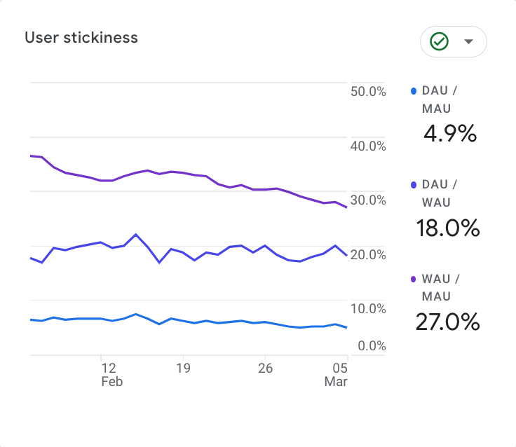
WAU and MAU can help you understand if your user engagement has increased or reduced over time, while also identifying how seasonal changes or oddities affect engagement. DAU, on the other hand, helps you pinpoint patterns on a more minute level. For instance, say your overall website traffic is largely the same week over week. How do you determine which days your users use your website the most? Is it weekends? Is it a specific day of the week?
Knowing this information can help you plan and run offers and promotions when your users are most active.
It can also help you understand your audience better. For example, if your website experiences high traffic during weekends, it could be because your users are white-collar workers who have more time off on the weekends to explore the services they need. On the other hand, if traffic is higher during weekdays, it may be because your users have more time in between work hours to casually browse for information.
How it works: Unique tracking IDs are also used to calculate DAUs, WAUs, and MAUs, similar to total active users.
New Vs. Established Visitors
Visitors can be broken down into two main groups in Google Analytics 4: new and established visitors. New visitors refers to website visitors who are visiting your site for the first time in 7 days. Conversely, returning visitors are visitors who have visited your website more than once in a week.
By tracking new vs established visitors, you can identify gaps in your sales funnel.
If you notice a high number of new visitors, but very few returning visitors, it could indicate that your brand is unable to move customers into the next stage of their buying journey. Maybe it’s because you don’t have a decent lead magnet that prompts them to sign up for your newsletter, and your brand has no way to encourage them to come back. Or maybe you don’t engage them with retargeted ads after they leave your site. Even worse, maybe they did sign up for the newsletter but have no reason to visit your site again because your offers aren’t compelling enough.
Identifying such gaps is the only way to find strategies to close those gaps in your sales funnel, and thereby improve your overall revenue.
How it works: GA4 tracks new and returning visitors with the help of first-party cookies and other identifiers such as browser footprint and IP Address.
Retention Rate
Retention rate measures the percentage of users that use your products or platform regularly over some time.
In the GA4 retention overview report, Google “summarizes how well your website or app retains users, including the average amount of time users spend engaged on your site or app after they were first acquired and the percentage of users who return each day in their first 42 days.”
By analyzing retention rates, businesses can judge how helpful their application or content is. You can also gauge your customers’ loyalty to your brand as typically only loyal users return frequently.
You can also study the retention rates of different channels to understand which marketing channel is most effective in attracting and keeping your customers loyal.
How it works: Google Analytics calculates retention using first-party cookies.
Churn Rate
Churn rate means the percentage of users who stop using your website over a specific period. It is essentially the opposite of the retention rate.
It helps businesses gauge user retention and identify areas for improvement. If a website has a high churn rate, indicating many users are leaving—the business might analyze user feedback, optimize website content, or improve the user experience to retain more visitors.
How it works: You can set up predictive metrics in GA4 that show you the probability of customers who are likely to not return during a specific period. However, to calculate the definite churn rate for your website, you need to do some work manually.
To get your website churn rate, divide the number of users who stopped visiting your website within a specific period by the total number of users, then multiply by 100 to get the percentage.
Net Promoter Score
Net Promoter Score is the only metric on this list that doesn’t rely on GA4 directly or indirectly.
It is a customer engagement metric that measures loyalty among your customers towards your brand by asking a simple question: on a scale of 0 to 10, how likely are you to recommend our product or website to a friend or colleague? A high score indicates that your product or website provides an excellent user experience and leaves your customer feeling satisfied.
You may have seen some apps or websites ask this question at the end of a shopping experience to get customer feedback on the “thank you” page or send a post-sales email to get your feedback. For example, Domino’s Pizza sends a customer service survey via email once your order has been processed.
Since measuring NPS involves talking directly to your customers, you can also take this opportunity to ask open-ended questions like “What is one thing you would like to improve about our service or product?”.
This gives your customers the forum to provide their unfiltered feedback. You can use this information to understand how your customers interact with your products or services, the problems they face while using them, and how you can improve their overall experience with your brand.
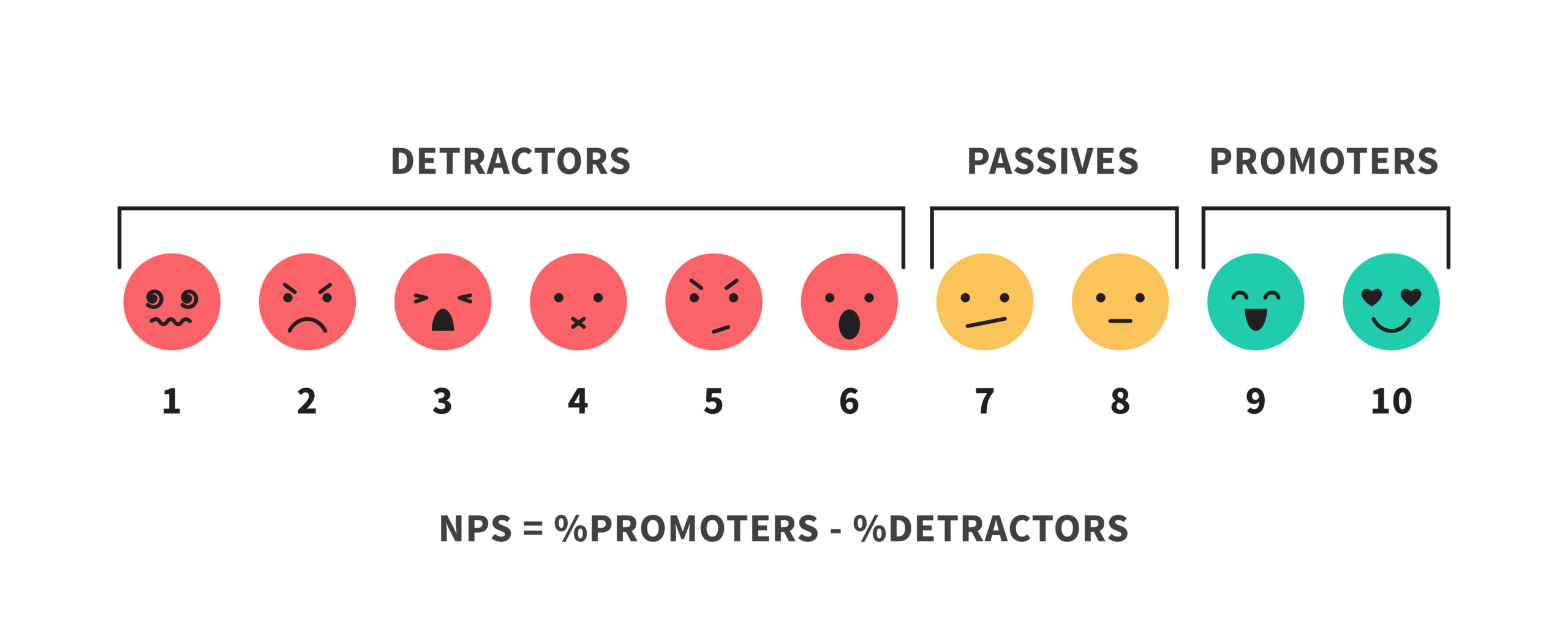
NPS scores can be categorized into three main groups:
- (9-10) Promotors: Loyal users who will most likely recommend you.
- (7-8) Passive: Neutral users. They might promote or detract.
- (0-6) Detractors: Unsatisfied users who might spread negativity.
How it works: You get your NPS by subtracting the percentage of detractors from the percentage of promoters.
Page Views/Screenviews
In Universal Analytics, Page views measure the number of times a specific webpage on your website was loaded by a browser.
In GA4, Screenviews measure the same thing. Technically, Page Views and ScreenViews are the same thing, however, because GA4 and UA use different data attribution models, they may be counted a little differently.
According to Google, “The Pageviews total should be fairly close between Universal Analytics and Google Analytics 4, usually within a few percentage points since the Google tag functions identically when recording pageview hits. The range of variation between the totals is usually due to different filters applied in Universal Analytics and Google Analytics 4.”
Here are some reasons to measure page views:
- Content Optimization: Page views help you understand which content is popular among your users. This information enables you to optimize existing content and create more of what interests your audience.
- Revenue Generation: Page views directly influence revenue generation, especially for websites reliant on advertising. Higher page views often lead to increased ad impressions, which can translate into higher ad revenues. Businesses can optimize ad placement, targeting, and content based on page view data to increase ad revenue.
- Competitive Analysis: You can use tools like Ahrefs or Semrush to check your competitors’ website traffic for similar pages. Comparing page views with competitors’ similar content may provide insights into your market positioning and performance. You can also use this to identify your strengths, weaknesses, and opportunities for growth.
How it works: When people visit a web page, each visit counts as a one-page view. If the same person visits the page multiple times, each visit adds to the page view count.
Average Engagement Time
Average Engagement Time measures the average amount of time users spend on a specific webpage before going to another one.
By analyzing how much time your users are spending on your key pages, such as landing pages and blogs that account for a lot of your traffic—you can understand how helpful a page is. You can also identify patterns in the type of content your audience prefers consuming.
If you consistently find that your “How to” guides perform better than “What is” content, it can suggest that your audience prefers reading practical guides on the subject more.
You can also use engagement time to figure out issues with your content. Low average engagement time can indicate that there might be usability issues on your page or that the content doesn’t match the search intent of the users.
How it works: Google Analytics tracks engagement time by measuring the duration between a user’s initial interaction with a page, like loading the page or clicking a link, and their last interaction before exiting. These interactions could include clicks, scrolls, form submissions, or other actions that trigger an engagement event.
Top Exit Pages
“Top exit pages” shows you a list of pages that users tend to exit your site from.
In other words, these are the pages on your website that don’t encourage your visitors to visit other pages on the website, and instead compel them to leave the website entirely.
But what if they simply stopped using your site due to a personal interruption, such as their phone battery dying? While these anomalies in data will always exist, they are rare. A consistent pattern of multiple users leaving your site after visiting specific pages shows you that there’s something wrong with those pages.
Such a page typically has either one or both of these issues:
- It doesn’t provide a good user experience. Maybe the page loads slowly, has distracting ads or popups, or simply doesn’t tailor to the search intent of users.
- It has no major UX issues but fails to engage the user with its language, images, and other elements.
Start by checking your page manually and see which of these issues it could be. Once you have established that it’s not the first scenario, start working on making your page better.
How it works: Google uses first-party cookies and unique tracking ID to calculate top exit pages.
Pages Per Session
“Pages per Session” shows you how deeply users engage with your website during a single visit. Essentially, you can see the average number of pages a user views on your site before leaving.
A higher number of pages per session typically means users are finding your content interesting and exploring more of your website. It also indicates that it is easy for users to navigate your website and find the information they need. The reverse is true if the pages per session are low, of course.
You’ll need to take a look at your overall website structure and navigation if that’s the case, and adjust it for the best user experience.
You may also need to check your menus and pathways between key pages and blogs to see that everything is okay.
How it works: Google Analytics pages per session with the help of first-party cookies and other identifiers such as browser footprint and IP Address.
Page Scroll Depth
Page scroll depth measures how far down a user scrolls on a webpage.
Imagine a progress bar on a webpage that fills up as the user scrolls down, showing how much of the content the user has viewed. That’s exactly how page scroll depth functions, in that it shows you the percentage of a web page that was scrolled.
Page scroll depth is calculated in two ways:
- Per User: This provides data on how far each user scrolled down a webpage before leaving. It is typically shown as a percentage of the total page length (0% for not scrolling at all, 100% for scrolling all the way down).
- Average Scroll Depth: This takes the scroll depth of all users for a specific page or group of pages and calculates the average percentage. It gives a general idea of how far users typically scroll on that page.
Both metrics are valuable for understanding user behavior on your website. Here’s a breakdown of their purpose:
- Per User Data: This provides minute details of user engagement. You can see which users are actively scrolling through your content and which ones are dropping off early. This can help identify potential pain points or areas where users lose interest.
- Average Scroll Depth: A high average scroll depth (generally above 75% for long-form content) might indicate users are engaged with your content. Conversely, a low average scroll depth might suggest the content isn’t capturing user attention or the page design hinders scrolling.
If you notice your website’s average scroll depth is low, consider improving the overall content. If images are important on your website and they are not loading, it can also be a reason. Contact your hosting provider to improve website loading speed and enable features like cache and lazy load.
How it works: Google Analytics tracks scroll depth with the help of first-party cookies. However, by default, GA4 only tracks scroll depth when a user scrolls past 90% of the page. This isn’t ideal. If you want to track scroll depth for other users, you’ll need to set it up manually.
Conversion Rate
Conversion rate refers to the percentage of website visitors who complete a desired action. This action could be anything from purchasing to signing up for a newsletter. You, as a business owner, determine what type of actions you want to track as conversions.
Ecommerce stores define conversions as the number of times a user adds a product to a cart. Similarly, a service business may define conversions as the number of times a user fills out a form on their website or signs up for a newsletter.
The best mark of an engaged audience is when they take desirable steps to deepen their relationship with your brand. Conversion rates are therefore the ultimate measure of an engaged audience.
Abandonment Rate
The abandonment rate is a metric typically only tracked in the case of e-commerce websites. Nonetheless, it might just be the most important metric an e-commerce website can track as it directly relates to sales.
The abandonment rate refers to the percentage of visitors who add items to their cart but leave the site without purchasing. Therefore, improving this rate will result in a significant increase in sales.
A user leaving at this stage of the process typically indicates an issue with the checkout process. You can use this metric to find ways to make it easier to transact on your website, such as reducing the number of steps required, allowing customers to use pre-saved browser data, optimize form fields for ease of completion, and offering multiple payment options.
How it works: While Google Analytics doesn’t show abandonment rates directly, it offers functionalities to help you calculate them based on your specific needs. You can set up goals and track user behavior through funnels. Pro Tip: According to Baymard Insitute, 70.19% of shopping carts are abandoned every day. Install a plugin that doesn’t let them back off and abandon your website without entering their email address or phone number. With that information at hand, you can regularly send promotional emails to get them back.