
Every platform you market on, including your website, social media platforms, directories, email, and forums, collectively contribute to your online exposure. But since most customers need to come to your website to seek more details or make a purchase, a website is usually the central piece of the puzzle.
As it directly impacts your business’s reputation, your website needs to deliver an optimal user experience.
First impressions can be the last — and that’s especially true for user experience (UX). Deliver poor UX, and your customers leave your website before purchasing or signing up for your newsletter. Guide them effectively through all stages of the buyer journey — and you get them to stay longer, and hopefully keep coming back for more.
It’s also UX that ultimately keeps people on the page after your other marketing channels have led the customer to your website. In fact, studies suggest that 89% of people have left a website with poor UX and switched to a competitor’s website at some point.
If you can imagine how much of a damage this can do to your revenue, you’ll see how valuable UX is for your business.
In this guide, we delve into how you can fix your website’s UX to drive more sales and keep your audiences engaged.
What is User Experience (UX)?
User experience (or UX) is about creating a hassle-free, smooth, and meaningful user journey on your website so that users can quickly find what they are looking for.
Your website’s layout and design, the ease of navigation, the quality of your content, and even your page load time can affect the UX. At its core, UX is about intuitively understanding what users expect—and how to deliver it in the most pleasant and quickest way possible.
Here’s an example: When you open the Uber app, you want the app to quickly let you input your location and destination information, understand how long you’ll have to wait, find a car type that suits your budget, and book it quickly. In case the ride gets canceled, it must offer a meaningful apology and help you book the next one seamlessly. If Uber does all of this every single time, you’ll keep returning as a customer and build trust in their brand. That’s the power of UX.
Take Your Website’s UX to the Next Level

- Create an Aesthetically Pleasing Website
Your website should be easy on the eyes and easy to explore.
You need to ensure that the entire website is designed with the user in mind, focusing on aesthetics, readability, and overall ease of interaction. For instance, you could use a font size that’s bigger than the ones standard websites use if your target audience is senior citizens.
Basically, put yourself in the shoes of the buyer and see what would make it easiest for them to navigate your website and transact with you—and go from there.
It will have great benefits for your business’s bottom line too. A well-designed user interface can drive conversions (i.e. making a purchase or subscribing to a newsletter) by up to 200%.
Best Practices for Designing a User-Friendly Interface:
- Maintain a consistent visual design across your website to give your website a cohesive and professional brand image. This instills trust among users.
- Incorporate visually appealing graphics to complement the text. This makes the website more visually appealing and engaging, while breaking up the space.
- Organize content logically to avoid confusing the users.
- Establish a design philosophy that aligns with your brand image. Avoid adopting trends, such as minimalism, merely for the sake of it.
- Prioritize users’ data security. This conveys your commitment to privacy, building user trust and confidence.
- Opt for Intuitive Navigation
Intuitive navigation clears the way for the users of your website to quickly do what they came to do there. The standard UX rule is: they should be able to get anywhere on the website they need to be within less than 3 clicks.
Clearly labeled product categories, a visible search bar, and clear call-to-action (CTA) buttons all facilitate easy navigation. Not only does this minimize their time and effort, but you also show them that you value their time.
Best Practices for Creating an Intuitive Navigation:
- Streamline menu items to help users quickly locate relevant sections.
- Ensure CTAs are prominent and easily accessible so that users can easily perform their desired action (making a purchase or signing up).
- Maintain a consistent navigation experience on different devices. This provides a uniform user experience, regardless of the device being used.
- Use clear and descriptive labels for links. This helps users anticipate the content they’ll find, aiding in decision-making.
- Implement a visible and effective search bar so that users can quickly find specific items or information, especially on content-rich websites.
- Use breadcrumb trails for complex websites. This helps users understand their location within the site hierarchy and navigate back easily.
- Refine Your Content Strategy
A well-defined content strategy is like a well-thought-out blueprint for your communication.
When you create content around keywords your customers actively look for, offer information and advice that’s valuable for them, and write in a tone that your customers resonate with—you anticipate what they need. When they visit your web page, they will be more engaged and read your content for longer.
This will not only improve the overall user experience but also get you SEO wins. There’s evidence that search engines reward content that keeps users on the page for longer with higher rankings.
Best Practices for Defining a Content Strategy:
- Know your target audience’s demographics, preferences, and pain points. This will help you make your content relevant and valuable to your audience, increasing the chances of conversions.
- Define specific goals for your content strategy like brand awareness, lead generation, or customer retention. Clear objectives provide direction, helping measure the success and impact of your content efforts.
- Identify relevant keywords for your industry and integrate them naturally into your content. Optimizing content for keywords improves search engine visibility, attracting organic traffic.
- Develop content that addresses your audience’s needs and adds value. Such content establishes authority, engages users, and encourages repeat visits.
- Stay abreast of industry trends and adjust your content strategy accordingly. This showcases your role as a reliable source for the latest and credible information in your domain, positioning you as an authority in the field.
- Personalize the User Journey
Personalization involves customizing user experiences by adapting content, recommendations, or features based on individual preferences and behaviors. This deepens users’ connection to the brand as you are able to anticipate their needs on an individual level.
This also increases engagement, encourages repeat visits, and builds a positive perception, ultimately amplifying online presence.
Best Practices for Personalizing Your Content:
- Divide your audience into segments based on demographics, behavior, or preferences. This approach enables targeted content delivery and increases engagement.
- Monitor user actions and interactions on your platform. This provides insights into user preferences and enables you to optimize your personalized content recommendations.
- Customize emails or notifications for individual user interests. For instance, you can send “welcome emails” with special discount coupons for new customers. You can also send personalized “We miss you – come shop with us!” emails with exclusive perks to entice them to visit your website again.
- Experiment with different personalized approaches to determine the most effective one. Ongoing optimization helps give better results over time.
- Build a Logical Visual Hierarchy
Visual hierarchy is about strategically organizing and presenting visual elements on your website or online platform based on their importance to improve website readability, facilitate easy navigation, and enable users to take action easily.
This in turn improves the overall UX.
Example:
A homepage with a good visual hierarchy will have a bold and contrasting headline to capture immediate attention. This will be followed by clear and concise subheadings to lead users through the content.
Eventually, CTAs like “Sign Up” or “Shop Now,” are prominently displayed, inviting users to take desired actions. This arrangement of elements directs users’ focus and provides a smooth interaction.
Best Practices for Designing a Visual Hierarchy:
- Establish a clear hierarchy for headings and subheadings to help users quickly grasp the structure and importance of the content. Emphasize the most important aspect of your design by making it the biggest. Likewise, make less-important elements smaller.
| Section | Font Size |
| Header | Up to 32 px |
| Subheader | 18px to 22px |
| Body copy | 14px to 16px |
- Use darker colors to emphasize elements. You can also use specific colors to evoke the desired emotions in users. For example, blue or green to make users feel relaxed. This approach draws attention to key information or CTAs.
- Use whitespace to separate and highlight elements. This enhances readability and emphasizes key content.
- Arrange content in a coherent order to lead users through a natural flow. Integrate visually appealing graphics or images to attract attention and reinforce the message or theme. Maintain consistency in design elements to create a cohesive visual experience
- Ensure interactive elements are visibly distinct so that users can engage well with clickable or interactive features.
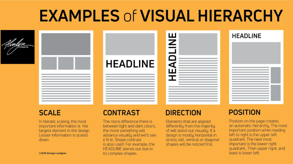
Visual Hierarchy
Source: Pepper Content
- Keep Your Branding Consistent Across All Platforms
Consistent branding is about keeping the visual elements like logos, color schemes, and typography consistent across different pages and interactions as a harmonious brand identity makes a brand appear more trustworthy and recognizable across different channels.
Consistent branding also strengthens brand recall value and in this way, amplifies online presence.
Best Practices for Keeping Branding Consistent:
- Place the logo consistently across all pages and use it appropriately. Ideally, position the logo on the left, as it is one of the first things users see on the website. This placement makes the brand more noticeable and builds brand familiarity.
- Maintain a consistent tone of voice in written content to engage users. Adapt it to your goals and audience. For instance, if your goal is to promote a product range to the GenZ audience, consider using a casual and friendly tone and voice. Plug in humor that resonates with your audience.
- Keep the navigation design consistent throughout the website to ensure familiarity with the interface. Focus on user journey and convenience when designing navigation.
- Use consistent styles for buttons and CTAs. Inconsistent designs confuse users. Achieve consistency by choosing a single color palette, icon style, typography, and similar design choices.
- Follow brand guidelines to ensure all design and content align with the established brand standards. Extend consistent branding to social media platforms.
- Include Some Interactive Elements
Interactive elements like audio, video, and dynamic visual elements, captivate visitors, making them explore your site for a prolonged duration. The user experience becomes distinctive and enjoyable, triggering constant returns to the website and conversions.
While interactive elements contribute positively to online presence, they are not mandatory for all websites. A website’s nature, its content, and the target audience determine if interactive elements are required.
For instance, e-commerce platforms, portfolios, or interactive applications are apt for having interactive elements. Informational websites, blogs, or websites with a more straightforward purpose will typically not require interactive features.
The key is to align the use of interactive elements with the goals and user expectations of the website. If the inclusion of interactive elements enhances the user journey, supports the content, and aligns with the overall brand image, without compromising on the website’s usability then it can be a valuable strategy.
Best Practices for Designing Interactive Elements:
- Make navigation intuitive with interactive menus and buttons.
- Use hover effects to provide additional information or visual cues. This encourages interaction.
- Include subtle animations for smooth transitions between elements. This enhances visual appeal and provides a seamless user experience.
- Ensure interactive elements are optimized for various devices.
- Offer interactive elements that respond to user preferences. This creates a personalized and user-centric experience.
- Design User-Friendly Forms
Intuitive forms make it easier for users to complete tasks without any obstacles.
They also reduce unnecessary steps, ask for information in a logical order, include features like auto-fill suggestions and real-time validation, and provide clear labels and guidance.
Making forms easier to fill makes it more likely that they will completely fill it up and sign up or enquire with you.
Best Practices for Creating User-Friendly Forms:
- Organize form fields logically to guide users through a natural progression. This makes it easy to complete the form.
- Provide clear and concise labels for each form field. Include helpful instructions or guidance where necessary.
- Implement auto-fill suggestions based on user input. This speeds up the form-filling process and reduces user effort.
- Validate form fields in real time. Instant feedback minimizes errors and ensures accurate data submission.
- Display progress indicators for multi-step forms. This keeps users informed about their position in the form completion process.
- Keep forms visually simple and uncluttered. This enhances user focus.
- Communicate errors and guide corrections. This avoids user frustration and ensures accurate form submission.
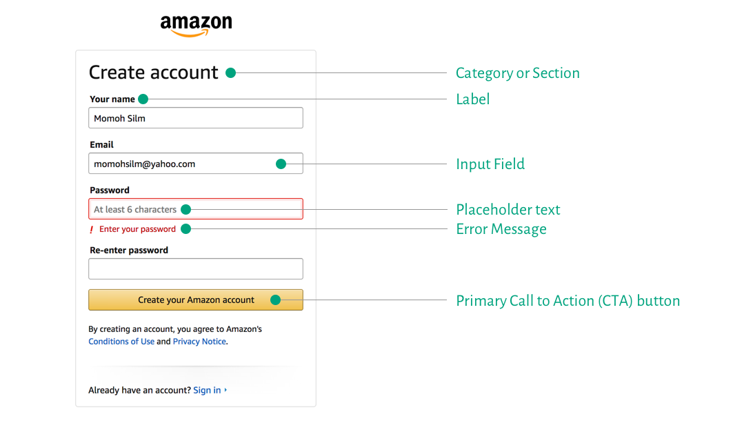
User-Friendly Forms for UX
Source: Prototype.io
- Consider Accessibility
Accessible web design ensures that your website is inclusive and user-friendly for individuals with disabilities. Addressing this need is critical not only for ethical purposes but also to gain a distinct competitive advantage in the digital ecosystem.
90% of websites remain inaccessible to individuals with disabilities. And almost 98.1% of home pages fall short of the Web Content Accessibility Guidelines (WCAG) 2.0.
When you make your website accessible, you broaden your potential audience and create a positive online experience for all. This inclusivity generates appreciation for your brand, which in turn can strengthen its reputation, and amplify its online presence.
Best Practices for Making Web Design Accessible:
- Provide descriptive alternative text for images so that users with visual impairments can understand the content conveyed by images.
- Structure content with clear and concise headings. Use simple words, short sentences, and an active voice. Avoid technical terms, unnecessary words, and fluff. Clear content makes navigation smooth and helps users find their content easily.
- Ensure sufficient contrast between text and background colors. The minimum recommended color contrast is 4.5 to 1. This contrast enhances readability for users with visual impairments or color blindness.
- Enable easy navigation using a keyboard. It assists users with motor disabilities who may rely on keyboard navigation.
- Use closed captioning for all videos. Unlike subtitles, captions run in tandem with video. It doesn’t just include speech, it also includes noises (ie; a knock at the door, the sound of whistling, etc.)
- Use descriptive and meaningful link text. It helps users understand the purpose of the link, especially those using screen readers.
- Maintain a consistent navigation structure. This assists users in understanding and predicting the website’s layout.
- Design forms with accessibility in mind. This facilitates form completion for users with various abilities.
- Use a font size of at least 16px. Ensure that text can be zoomed to 200%. Have liquid layouts that can accommodate 200% text. Use a large enough font size for body text so that people can comfortably read. Allow users to resize text. This allows the users with visual impairments who may need larger text.
- Limit the use of automatic media. This includes videos or speech that begins to play when your site loads.
- Make customer service options easy to find and have multiple contact options (ie; phone, live chat, etc.)
- Optimize Your Website for All Devices with a Responsive Design
Responsive design means that your website seamlessly adjusts its layout and functionality to suit various screen sizes.
Whether users access your site from a desktop, tablet, or smartphone, the content and features are automatically optimized to provide a smooth browsing experience and prolonged engagement with the content.
Nearly 59% of internet traffic comes from mobile devices, but many websites offer a subpar experience there. Considering this will set you apart and make your website seem more trustworthy.
Best Practices for Making Web Design Responsive:
- Optimize images for faster loading times. Page loading speed is crucial for retaining user interest and engagement. 40% of visitors will leave a website if it takes longer than 3 seconds to load.
- Ensure text is legible across all devices to enhance website readability and sustain user satisfaction. Your visitors want to be able to find the information they’re looking for on your website as quickly as possible.
- Shift from fixed pixels to flexible grids for fluid layouts. This enables your layout to dynamically adjust to various screen sizes. It provides a consistent and visually pleasing experience across devices.
- Use pre-built responsive frameworks to speed up the development process and make it efficient.
- Use Scalable Vector Graphics (SVGs) instead of raster images for scalability. This ensures crisp and clear visuals on devices with varying screen resolutions.
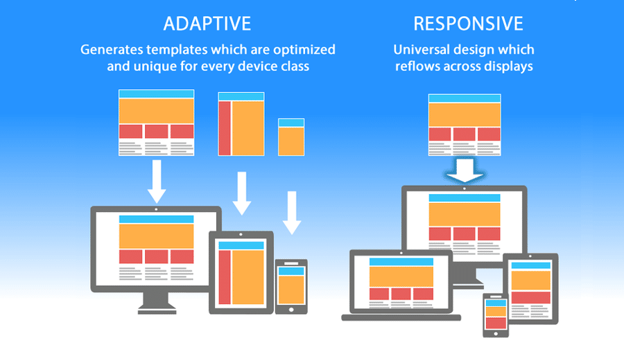
Responsive Design
Source: Kinsta
- Apply Feedback Mechanisms
Feedback mechanisms collect opinions, preferences, and suggestions directly from users in real-time.
Analyzing these insights can help you understand your audience better and tailor your strategies accordingly. You can also respond to feedback through various channels, including online platforms, surveys, customer support channels, and social media.
You can also acknowledge feedback publicly, address concerns, provide solutions to issues raised, or express gratitude for positive feedback. But the best way to use these insights is to make improvements to your products, services, or user experiences.
Best Practices to Design Feedback Mechanisms:
- Communicate openly about how you use feedback. Transparency reinforces trust.
- Offer various channels (e.g., surveys, social media, customer support) for users to provide feedback. This approach accommodates user preferences, making it convenient for them to share feedback.
Tools to Measure UX Performance
These tools provide valuable insights into user interactions, showing you where they click and how they navigate through your site.
| Tool | Key Features | Benefits |
| Google Analytics | Offers comprehensive insights into user behavior Tracks page views, bounce rates, and user journey paths Uses features like behavior flow to understand how users navigate your site | Identifies high-performing pages Optimizes pages with high bounce rates Refines website structure and content strategy Directly impacts user satisfaction and SEO rankings |
| PageSpeed Insights | Analyzes website speed performance Evaluates elements impacting page speed (e.g., image optimization, server response time) Provides a score with actionable suggestions | Directly improves SEO performance Enhances user experience by reducing waiting times Gives actionable recommendations for optimizing site speed |
| Microsoft Clarity | Offers free tools — session recordings, heatmaps Session recordings examine user behavior in real-time Heatmaps highlight user clicks, scrolls, and attention areas | Determines user behavior as it happens Identifies areas of user engagement Optimizes website based on user interactions |
| HotJar | Offers tools like heatmaps and session recordings Offers survey and feedback tools for direct user input Integrates with tools like HubSpot, Mixpanel, and Google Analytics | Understands user interactions Gathers direct input from users Creates customizable feedback forms Offers collaboration features Integrates with leading tools for enhanced insights |
| Core Web Vitals Tools | Offers dedicated tools for Core Web Vitals metrics (LCP, FID, CLS) Metrics focus on loading speed, interaction responsiveness, visual stability Is important for SEO ranking | Optimize Largest Contentful Paint (LCP) for faster loading times Minimize First Input Delay (FID) for instant responsiveness Reduce Cumulative Layout Shift (CLS) for a stable browsing experience Enhances user satisfaction through improved website performance |
Final Words
Improving your website’s UX is key to attracting and retaining users, but is not easy. There are many quick fixes that you can implement, but additional skill and expertise may be required fully optimize your site.
If you don’t have the time to learn UX tactics and apply them effectively or would rather not touch something you don’t have professional experience in — we are here to help.
Unframed Digital has a team of experts who understand the intricacies of UX optimization to help you deliver memorable digital experiences. Contact us today to get started.


